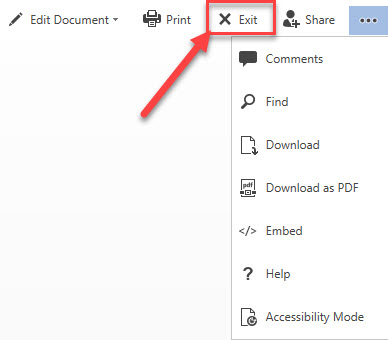
I was looking at a document stored in SharePoint using Word Online this morning and spotted a button I had not noticed before. The Exit button is tucked between the Print and Share buttons on the far right of the ribbon in Word Online – see:
Why I’m excited about the Word Online New Button:
This new button is SO much more intuitive for end users. End users are used to the Microsoft Word desktop program experience. They’ll be looking for an X icon in the top right part of the screen and now they will find one!
If you are new to the Online version of Microsoft Word, I’ll explain what the “old way” was like:
The “old way” was frustrating for end users.
To close a file and get back to the library where the file lives, you had to click on the library title on the far left of the ribbon (see example below). Some reasons that end users found it frustrating:
- Many end users who were used to Word desktop program would look for an X icon in the top right and end up closing the browser by accident (saw this happen many, many times).
- It looked more like text than a clickable link.
- This text would change depending on the file you were looking at. Many end users found this confusing and not intuitive, as many they didn’t realize where the file lived.
Kudos to Microsoft for making this change! How did we live without the exit button on Microsoft Word.
Looking for more Word Online Tips?
How to sign out of Microsoft 365 from all devices from a single location becomes a whole lot easier with this Regroove tutorial here. An Office 365 admin can go to forcefully sign out a user from one simple, central place.
Want to customize your Microsoft Word ribbon? Learn how to create a customized MS Word Ribbon and helpful keyboard shortcuts here in our blog.

