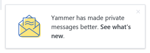
Last night I was using Yammer when * BAM * – a change to the Yammer user interface caught my eye. This little popup appeared in the bottom right hand corner… see:

The pop-up persisted and I didn’t want it to disappear without understanding what had changed so I was compelled to explore the new layout at the bottom of the Yammer pane where all the groups in the Yammer Network are listed. A new “Private Messages” section was now visible.

The other thing I noticed was that the Chat feature had disappeared. Here is an example of the old Yammer interface with the Chat window in the bottom right hand corner – big thanks to my colleague Noel Feliciano for sending me a screenshot!

So as you can see in the new Yammer interface, a series of names is listed below the “Private Messages” heading. At first I was confused. Why are there multiple instances of my peers within the Yammer Network… see “Sean Wallbridge” for example:

After clicking on the first one in the list, I was taken to a Private Message screen to a private message I sent my colleague Sean in November 2016… Weird.

We rarely use the Private Message functionality in Yammer as we have Skype for Business which is our primary tool for Instant Messaging. I do understand the value of messaging in Yammer as you can move a private conversation to a group – getting that conversation out loud to others. At the same time this seems slightly dangerous. Definitely not the place to be having those NSFW conversations or gossiping about your colleagues!
As there are twelve people in the itgroove Yammer network, I wanted to know how to send a private message to someone whose name was not listed… the small plus symbol to the right of the “Private Messages” heading did the trick.

A pop-up appeared that allowed me to create and send a new Private Message and add participants to that conversation. Pretty simple, pretty intuitive.

The other major difference to the Yammer user experience was the changing of the position of the Settings cog icon. It had moved from the bottom of the pane to the top of the pane – see:

I must admit I do like the way the Settings cog menu opens up now – much easier to read and scroll down to what you need – such as switching to another Yammer Network.

It was clear that all the changes involved moving buttons and functionality away from the bottom of the screen. I have a few ideas why this was done:
- To open up that space for something new coming in the future or
- To just make more real estate for reading content
- To drive focus and attention to buttons and functionality that was often overlooked
- To make it very clear when there are unread messages in other Yammer Networks that users may of been missing *
* How do you know there’s an unread message? The tiny blue dot beside the Settings Cog icon.
What do you think? Do you like the changes – why or why not? Let me know in the comments below.
Hi Kelly, did you maybe see, that some users of a network has the new user interface and some the old? We have this feature in our network… Thank you, Sebastian
Yes, Sebastian. A couple of our users (myself included) have the new interface and the rest have the old interface. Thank you for your comment. 🙂 Kelly
Hummmn! not sure. I like the fact that the reason for the change is to plan for future full integration with the Skype for Business Chat functionality, so one platform, one chat feature. What I instantly miss on the new interface is the “Who is available now” feature that was previously offered. I used this quite often when contacting colleagues using the Yammer Chat. I know it is offered via Skype and once the two formally combined, then that’s great but for the instance identification on availability is lost in the new experience.
That is a great comment Jon! Curious – have you tried out Microsoft Teams yet? (I’m just starting to dive in myself) There is a chat feature there that shows who is available now.
Yes, it is not inside Yammer, but maybe worth exploring?
Hi Kelly, How do you know which users are online? Before, with the old “Online chat” feature you knew who was online or offline by looking at the green dot next to the name… what about now?
I’ve always used Skype for Business to check if a person is online or offline, and to send instant messages/private chats. I prefer S4B because I can resize the chat window, and the Chat History is stored and searchable in Outlook 2016. You can also check status in Outlook 2016 beside the person’s name, and in the Contacts list.
So I’m not sad to see the online/offline status disappear out of Yammer. I found it to be clutter. The main reason for this is because Yammer is the place I go to post questions/information that I expect people to read and respond to later in the future. If I need instant communication with someone, I check their status in Skype for Business, then sent them an instant message or pick up the phone.
Also, I will (soon) be using Microsoft Teams which has a chat feature that shows each person’s availability in the same consistent way it was done in Yammer and in Skype for Business – e.g. red/yellow/green – busy/away/available.
I am not familiar yet abaout Microsoft Yammer
Herman, are you saying you’d like to read a blog post that helps familiarize you with how to use Microsoft Yammer? I’d be glad to write a post on that subject, if you like?
Yes, ofcourse. i will read your post. Thank you..