The upgrades and add-on’s just keep appearing in Office 365.
The Office 365 App Switcher has started to roll out to tenancies as of this week. This is nothing earth-shattering but it is a welcome feature being added to Office 365’s feature set. In a nutshell it replaces the “ribbon” of apps that was laid out horizontally in the coloured bar at the top of your Office 365 portal screen with a clickable button that displays all of your application choices in a “megamenu” style.
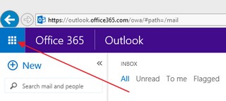
The App Switcher is located on the far left upper corner of your Office 365 screen and looks like 9 boxed squares:

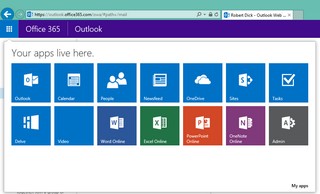
When you click on it you get an expanded menu of apps that are available to you:

Your list may not look exactly as mine as it will depend what apps you have made available to you. You click on what you want and, voila!, App Switcher sends you to the app very quickly. My screen clips are form IE11 but it pretty much works the same way in other browsers.
OK, so it’s not earth shattering (didn’t I say that already???) but it does make switching between your applications in Office 365 just that little bit easier and faster. Microsoft is rolling out changes to Office 365 on a regular basis, this is an example of incremental improvement to the UI/UX experience. Nice!